
Is my site really mobile ready?
Amidst all this technological turmoil, many people tend to think, “well, I have my responsive web page finished, so I guess I am mobile ready?” Well, probably not yet. The thing is, most designers forget about one “small” detail – performance. Usually, the biggest flaw of responsive design is its speed. Here goes an attempt to explain this aspect without entering too much into tech details.
In responsive design, you scale elements (including images) on browser screen to match users device size. But this doesn’t mean you actually make big image any smaller. What this scaling does (the scaling is mostly done in CSS) is to take the original image and tell the browser to show it as a smaller image. What it means is:
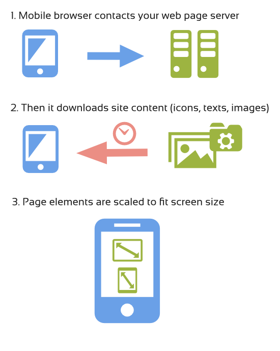
This way, if you have a big image to match large desktop screen, this image will be loaded by mobile devices also, it will just appear smaller. The bigger the image, the slower it will take to load it. And on mobile devices it will make even longer, as those normally have much slower internet connection than your laptop or desktop pc. Apart form images, there are lots of other elements that are loaded to make the page look nice. Those elements are sometimes hidden by responsive design for smaller screens because they are not needed or they just use too much screen. But like with images, they are still loaded by mobile users, even if they are not displayed.
Well nobody likes to wait, so if the visitors are forced to wait too long, they will probably leave the site. Also, if the site is too big while having many visitors per hour, it may significantly slower your server, and consequently your web page, even more. In other words, websites that suppose to be mobile friendly don’t serve their purpose if they load too long. Optimization for speed is a must-be in the small screen size world.
Is there anything we can do about it?
The answer is, of course, yes. There are a few ways to optimize responsive design pages. Apart of course from doing nothing (which is sadly the most common approach).
There are also some basic things you should always do independently whether you deal with responsive designs or not.
-
Compress all your images so that their size will decrease, which means loading faster and using less server bandwidth.Use services like:
Compressor.io
Kraken.io -
Think whether you really need all of those bells and whistles, turn off all those functionalities you don’t need or you don’t use right now.
-
Use plugins for your CMS or online shop that will optimize your content. Normally what they do is to compress content they send to visitors so that it takes less to send it. They also cache content (save most used parts of your web page and serves it in more efficient way). There are many of them available for any platform. Just to name few plugins for WP: APC, W3 Total Cache or WP Super Cache
There are also some more advanced techniques to optimize your web page. All of them have one thing in common: detecting visitors screen size and serving resized(smaller) and optimized images for this screen. As it usually happens, most of those solutions are not perfect. So the best approach is to use multilevel optimization or mixed techniques to get a final effect as foolproof as possible.
Just before ordering your web page, make sure that your designer understands the need of optimization or – even better – that the company you hire has a server administrator capable of tuning your server and website for faster mobile experience.
Advanced responsive design optimization solutions.
If you are not scared of technical details I will name 3 mainly used methods of advanced responsive design optimization.
-
Javascript optimization.
This will use some special written code (javascript) to detect visitors settings and then on the fly overrides big images with their smaller versions.
While it can detect various different settings, this approach sometimes tends to fail to optimize anything. Because modern browsers fetch images before they execute java scripts, chances are that you will force visitors to download the same image twice (first the big version and then the small version), this is not what we really want, is it?
There are many new variations of this method appearing that try to address the problem, so these solutions are starting to work better, but still they are fair less effective than server side optimization. The biggest advantages of this solution are easiness of implementation and possibility of detecting many other settings than just screen size. -
Server side optimization.
This will use special server configuration to detect the browser version of the visitor and see if this is mobile, tablet or desktop. Then it directly serves appropriate version of the image. This method is very fast and the gains in performance are really big but it fails to detect many devices and you need to constantly add new browser versions. Also it is unable to detect visitors screen sizes. It can only detect if its mobile, tablet or desktop and even here it can fail sometimes.
(Well, to be honest. there are high-end server detection systems with device database constantly updated but they are very expensive and are normally directed to corporations or big companies). So this approach will require deep server knowledge and thus it will be more expensive to setup and maintain. But this is the option that gives the highest speed increments. -
The best of the two worlds.
This approach mixes the js detection possibilities with server side optimization. Basically, the javascript is responsible for detecting the screen size and then communicating it to the server (using special cookie), the server then recognizes the cookie and serves images accordingly to the screen size. It also has a fail-safe mechanism: if by some reason the cookie is not set fast enough for the server to react, there is a server level device detection (although not perfect, it will be enough as a backup mechanism) and will try to serve image accordingly to the system detected (mobile, desktop or tablet).
This will give you both the flexibility of visitors settings you can detect and the speed of server side optimization.
Of course, even this system can sometimes fail to detect the visitor’s screen size accurately, but because of the double check the chances are much smaller.
You would still need a system administrator to setup the server for this solution and you’d have some maintenance costs, but those would be lower than in case of pure server side optimization.
By far this third option is the best solution to implement, and the most cost effective.
To sum up
Responsive design is a must-have these days, but only if properly set up. Choose the option that is best for you and make sure your designer understands this issue and takes it seriously.