
A couple of weeks ago Google announced that on 21st of April it will upgrade its algorithm to consider mobile-readiness when ranking website position in search results. In other words, starting from April 21, 2015, websites that are not adapted to mobile devices will drop in search results.
What is this Google algorithm anyway?
Google search engine algorithm is a program that decides how high a web page should be shown in the search results for a given keyword. Establishing accurately if the web page is fit to be shown for those keywords is a complex task.
Google algorithm takes into account many things like site content, links leading to this page and those links’ titles, images, social media and even page load speed.
Normally, Google tends to update its algorithm constantly, with major changes taking place once a year or two. All of those mayor changes are feared by SEO specialists and aware sites owners as often they mean changes and risk of loosing well established position. Especially if there is a lot of competition in your sector.
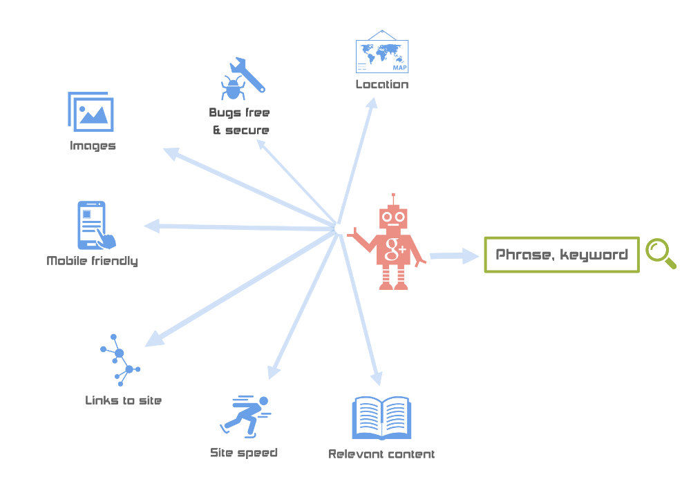 Google search engine algorithm at work.
More about April 21 update
This time the Google algorithm update is all about mobile. No wonder, almost 30% of global internet traffic is from mobile devices and mobile share is growing fast. Google partially revealed what will be taken into account while checking for mobile-readiness. All those things are centered around usability:
How fast the page opens on often limited mobile connections, is the website usable without zooming and scrolling horizontally, are all links made the way it is easy to click on them with your finger, does the site use technology that mobiles are not able to display (for example flash) etc. In other words, the algorithm will check all the things that most mobile users find annoying and it will assign your site a score. What impact will this mobile score have on the overall page rank is still unknown, but we can guess it will be important as Google went as far as issuing an official statement warning about those changes (Statement on official Google blog).
How does it concern me?
What it means for website owners is that they hard worked position in search results will start falling if their site is doesn’t meet the new criteria. Worse search results mean less visits, less clients and less conversions. Nobody can afford that. Most probably, your site or shop won’t loose its position from one day to another, but it will rather start slowly falling to the bottom. But while getting demoted in search results is easy, going up is really difficult. Of course you can always just ignore Google new algorithm and suggestions, but it is just a matter of time that you will be struck hard. Like we mentioned above, more and more people use mobiles to browse internet and while it is true that potentially they could view many NON-mobile ready pages by horizontal scrolling and zooming, in fact they are not very likely to do that because they simply find it annoying and time-consuming. Most users prefer purchasing from mobile-friendly sites and in most cases there is always some competitor that is offering this possibility. So sooner or later you will start loosing clients if you don’t adapt to new technology.
As for the solution, depending on how well your site is designed and maintained (updated), you would need either small fixes or to have your whole web redesigned to align with those demands.
How would I know if my site is mobile friendly?
If you are unsure about whether your page is or is not mobile ready, Google has provided a tool to do that.
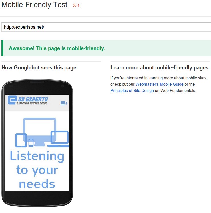
Google mobile-friendliness check tool in action
In a clear way it will show you if your site is adapted to mobiles and what it’s lacking. If you are in green just like us then it is all OK. But if you are in yellow or red there are things you need to change.
You can also get our free web page analysis and check your page in more details to see what changes does it need.
The new design
If a new design is the only option for your site / shop, the best practice is to make sure it will adapt to most of future devices without a hassle, using Responsive Design.
So don’t loose your time, don’t risk your position. Check your website and start preparing for a new design for you website. You should always try to be ahead of the competition anyway!
And dont forget to apply for free web page analysis :)
Update – 27 MArch 2015
Google hosted a Hangout few days ago to explain in more details some of the aspects of its new mobile friendly algorithm.
See our follow up on this topic